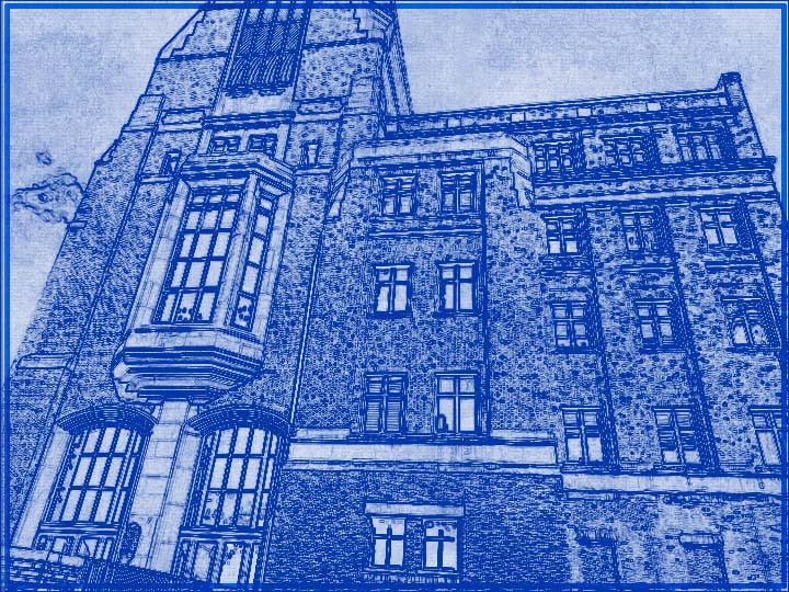
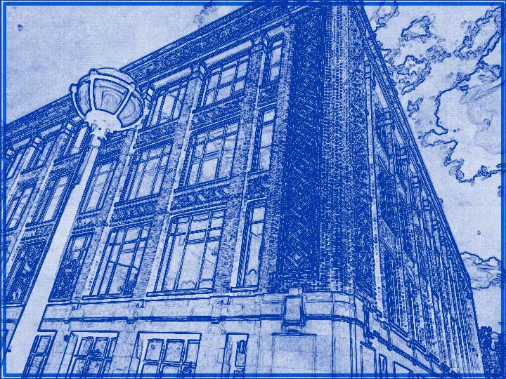
Weill Hall
|
How is it Pronounced
|
This was the first building I photographed. I thought the building, with its shape and size, looked really cool, so I decided to take a picture of it. Unfortunately, the bricks don't really come through in the blueprint version, but the shape still works out. Like with many of the architechture photos I took, I took the photos from an angle to try to make the viewer feel small.
The Long One
|
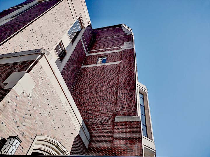
It's Tall, Too
|
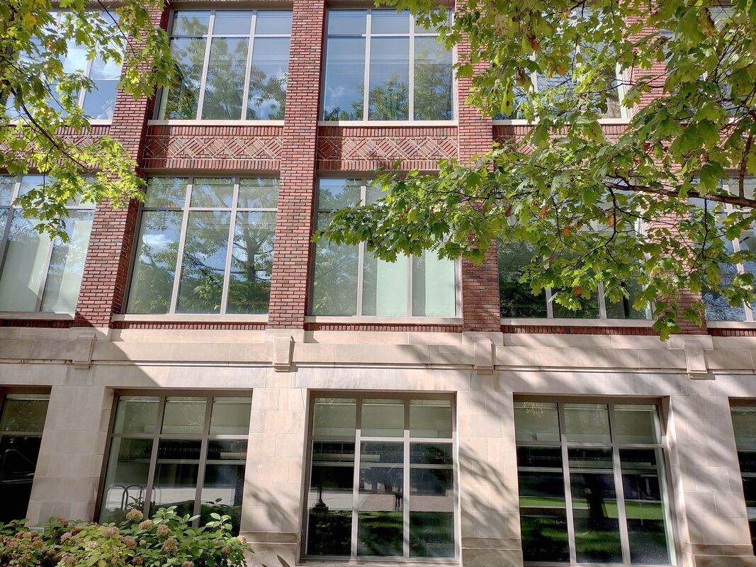
As I was walking, I came across this building. I really liked both the shape and color of the bricks and the shape of the windows. These kinds of bricks, being larger, came through better in the blueprint. For the second picture, I wanted to focus on the straight vertical line that is the corner of the section of the building, and I think that helped to increase how large the building feels.
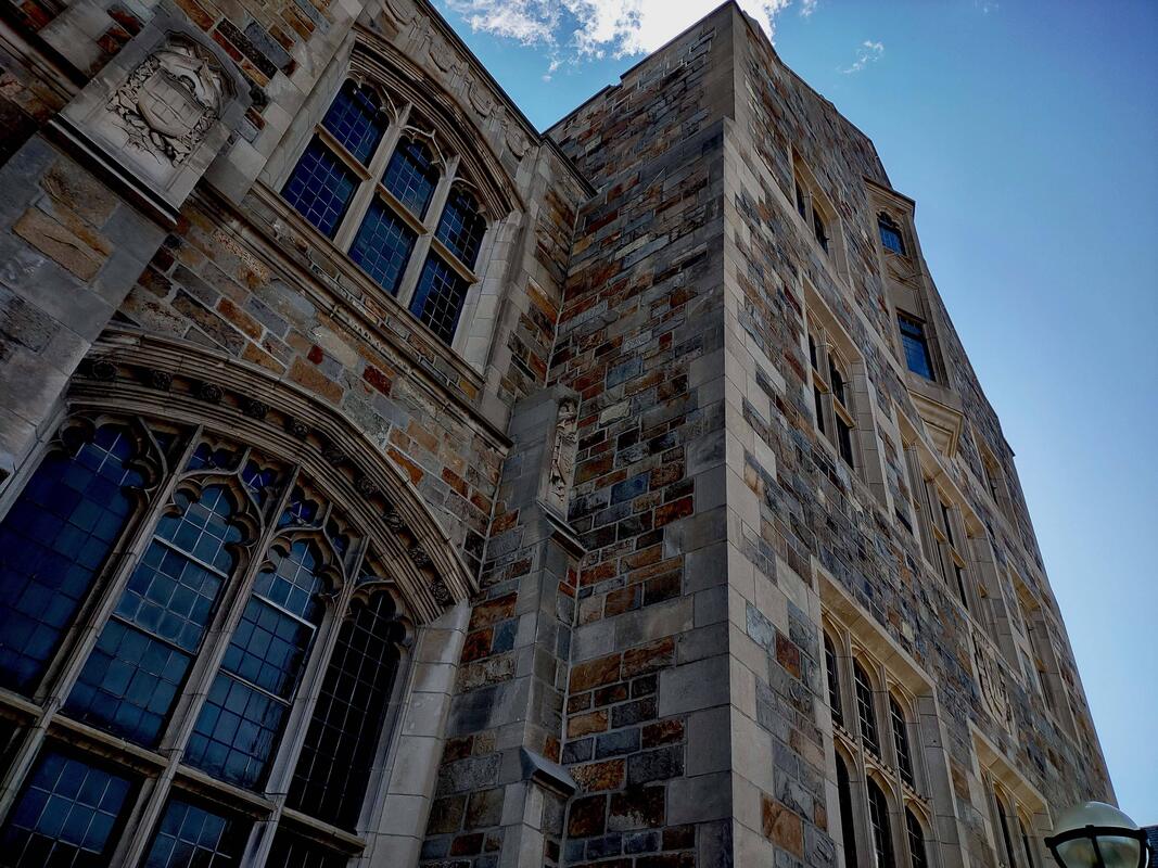
The Brick Pattern
|
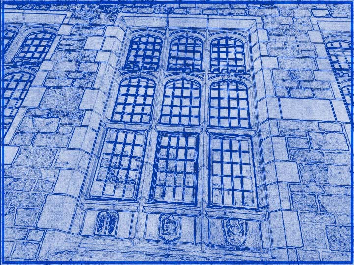
The Windows
|
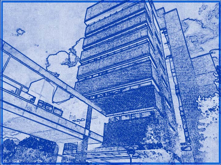
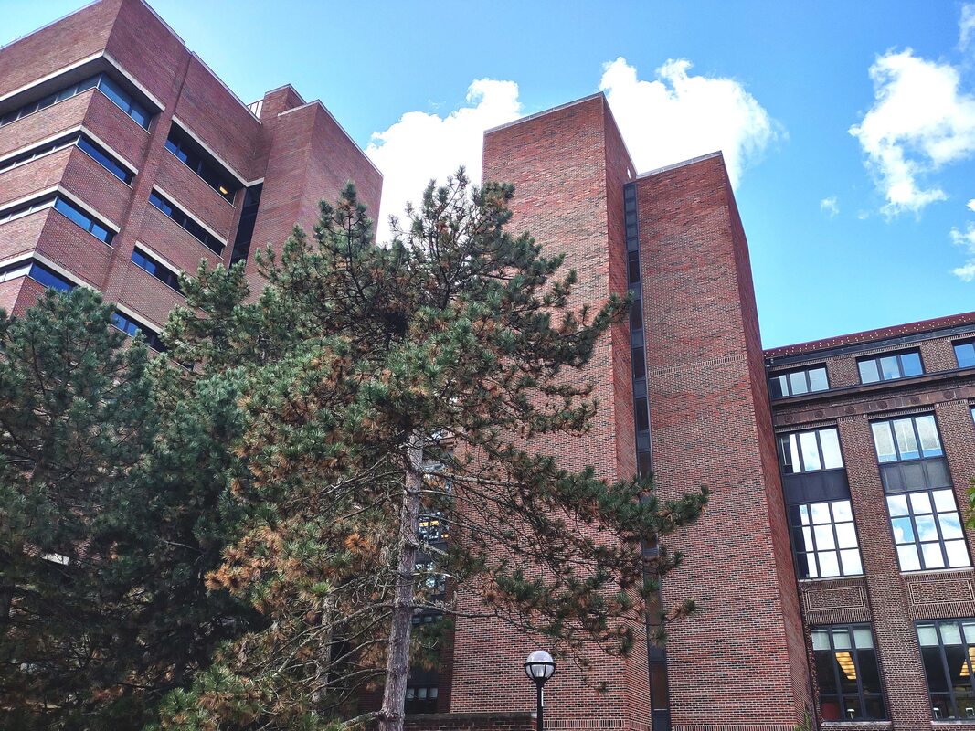
This was another brick-related thing that did not transfer as well to the blueprint format. The brick pattern was really cool, and I think the more filled-in view in the blueprint still looks good, even if it wasn't what I was going for. I also like how the corner is a little bit larger than the rest of the building, which came across well on the blueprint. The picture on the right was loosely inspired by one of the photos I used in my journal, which featured a very regular grid of windows, although from a different perspective and without the trees framing it.
To Connect the Libraries
|
Graduate Library
|
For the picture on the left, I took it because I really like the concept of elevated paths connecting buildings like this. Unfortunately, I hadn't taken any pictures that had no plants, which is a shame since plants don't really work well with the blueprint effect—usually blueprints are of man-made structures, after all. Still, I think it does a good job depicting the path between the two buildings. I took the picture on the right because it shows how tall the building is, especially in contrast to the lamppost, which looks tiny by comparison.
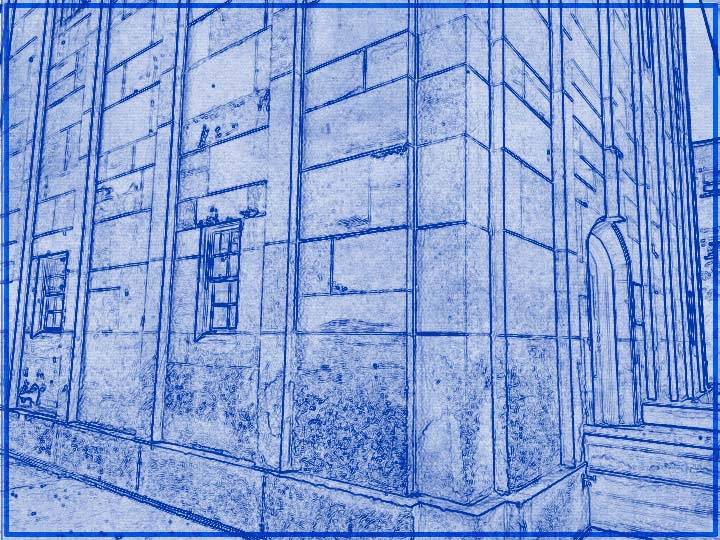
Bell Tower Foot
|
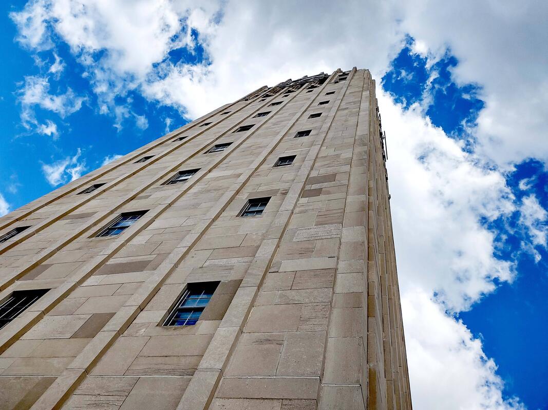
Bell Tower Neck
|
Because the bell tower is built from larger blocks, it turned out very well as a blueprint. Fortunately I took a picture that didn't have any clouds in it, because all the other ones did and clouds don't usually work very well with the blueprint effect. For the picture on the right, an interesting thing happened while I was editing it. When I was adjusting the contrast, I had expected it to look good with low contrast, but then I tried turning up the contrast and it made the sky very blue. I really liked that, so that's what I used for the final image.
